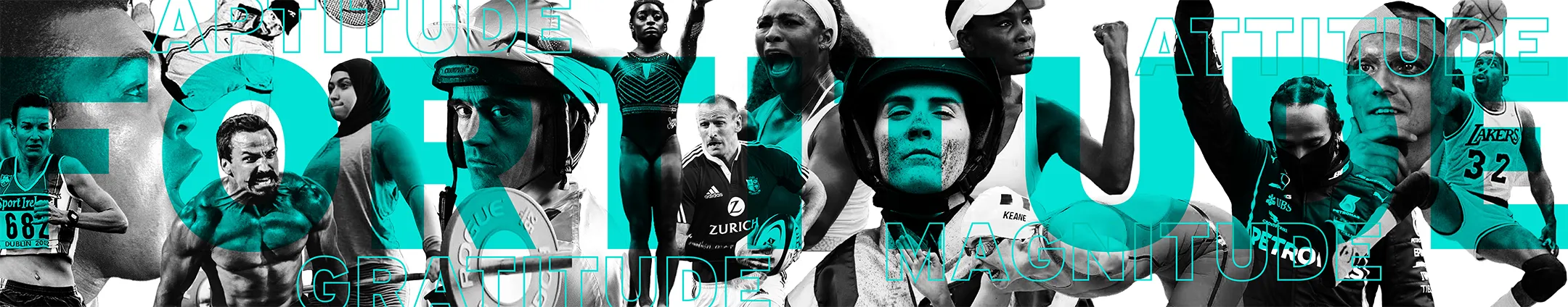
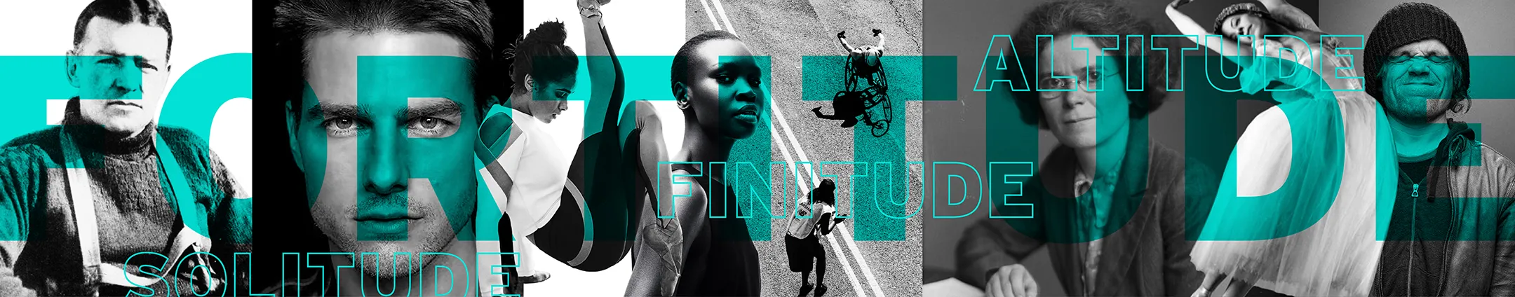
Adversity comes in many forms. It can be physical or mental, a once-in-a-lifetime challenge or an everyday struggle. In times of trauma, you need fortitude.
Having trained with Colin for years and worked on his previous brand, Colin Dempsey Personal Training, there was already a deep understanding of his mindset and approach.
Over time, the name began to feel restrictive. It narrowed the scope and left little room for future growth. When he introduced the new name, it marked a shift in ambition too.
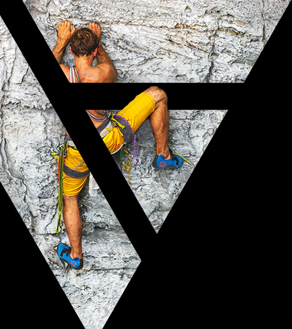
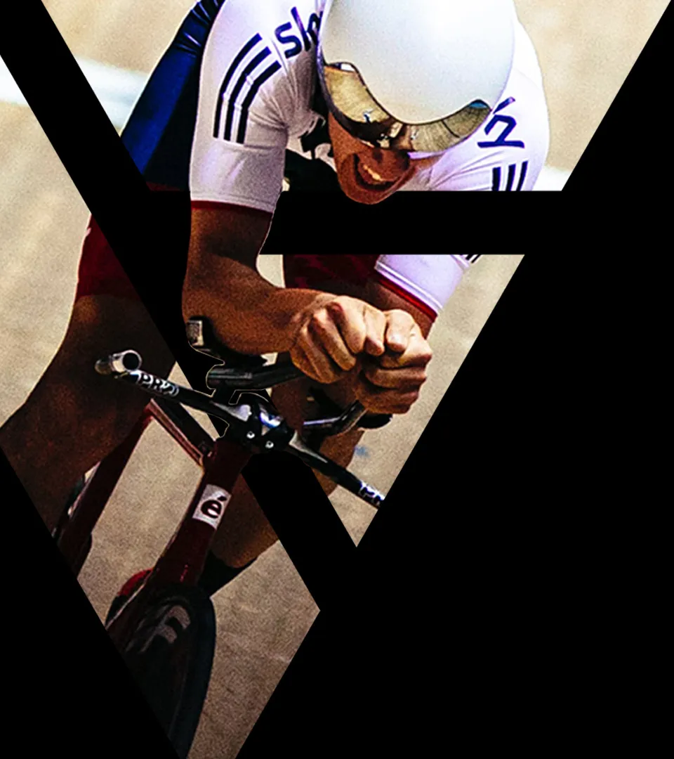
This was no longer about a one-man band. It was about building something bigger. The vision was clear from the start. Formula 1, cars of every kind, rugby, training, family and helping people sit at Colin’s core.
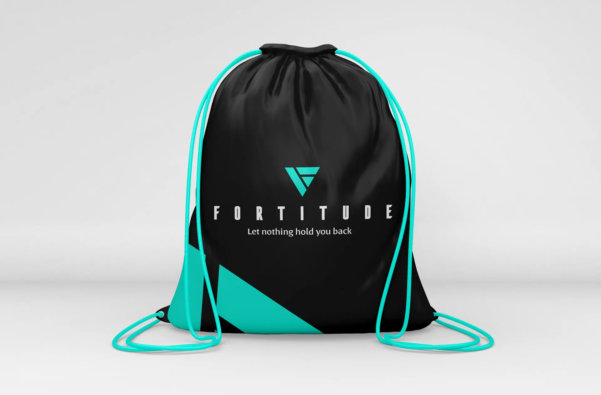
Together, we set out to create a brand that reflected that energy, putting grit, excellence and positivity at the forefront of everything FORTITUDE stands for.

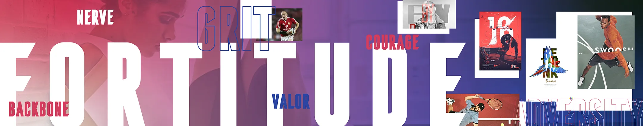
Each project begins with three or four style guides. These focused mood boards are a quick and effective way to capture the visual tone and personality a brand is aiming for.
With Colin, there was already a head start. A strong understanding of his values and what he stood for helped shape the direction early on. Across the three style guides, a few clear themes began to emerge:
Together, we refined the elements that resonated most. These became the foundation for the next stage of the FORTITUDE brand identity.
Alongside the research, ideas were explored quickly and loosely, keeping the process free and fluid. Very early on, in the first round of sketches, one mark stood out. Clean, simple, bold and strong. Exactly what you want from a gym brand.
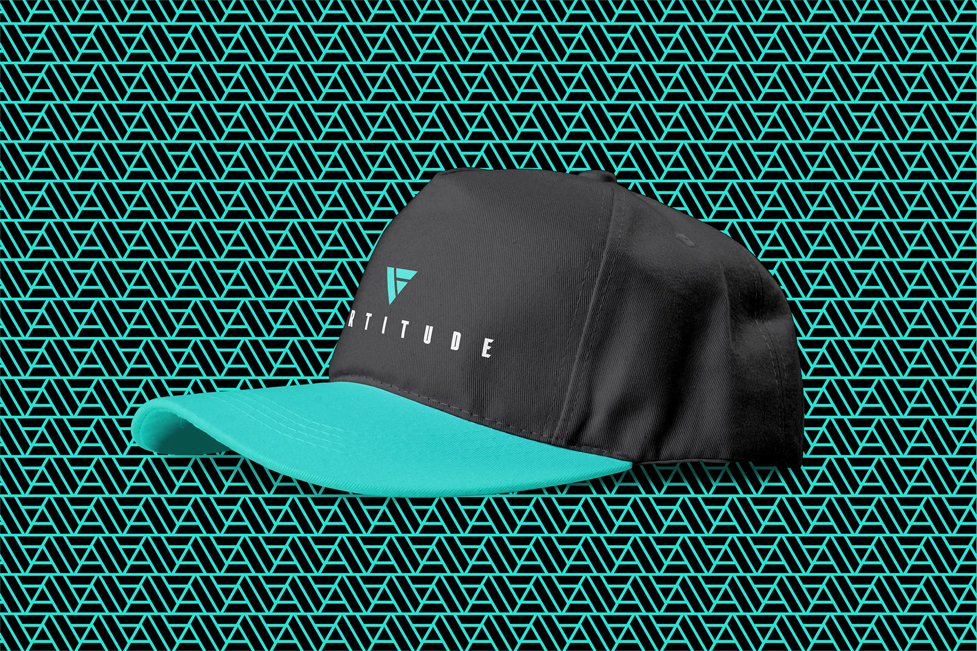
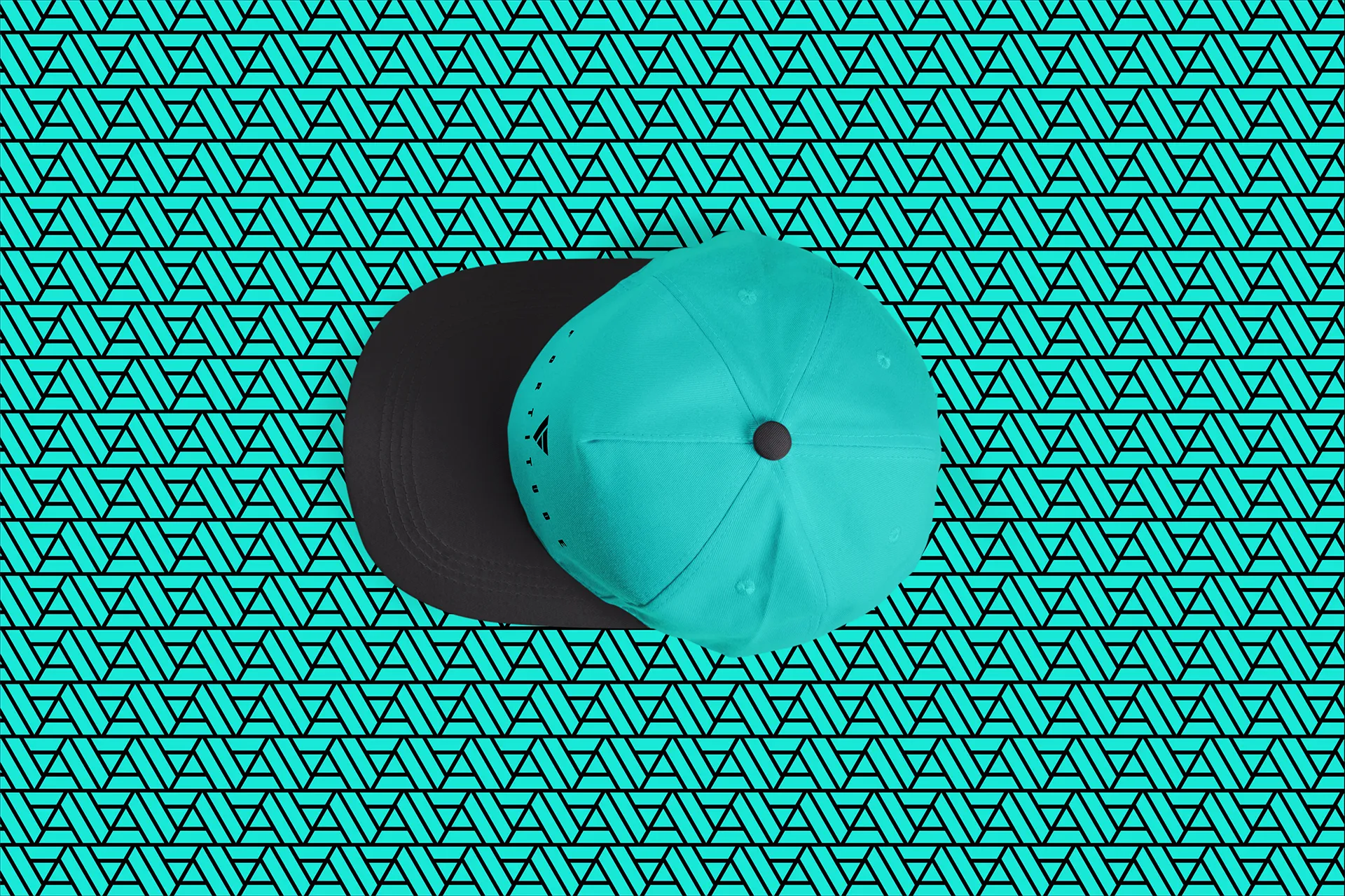
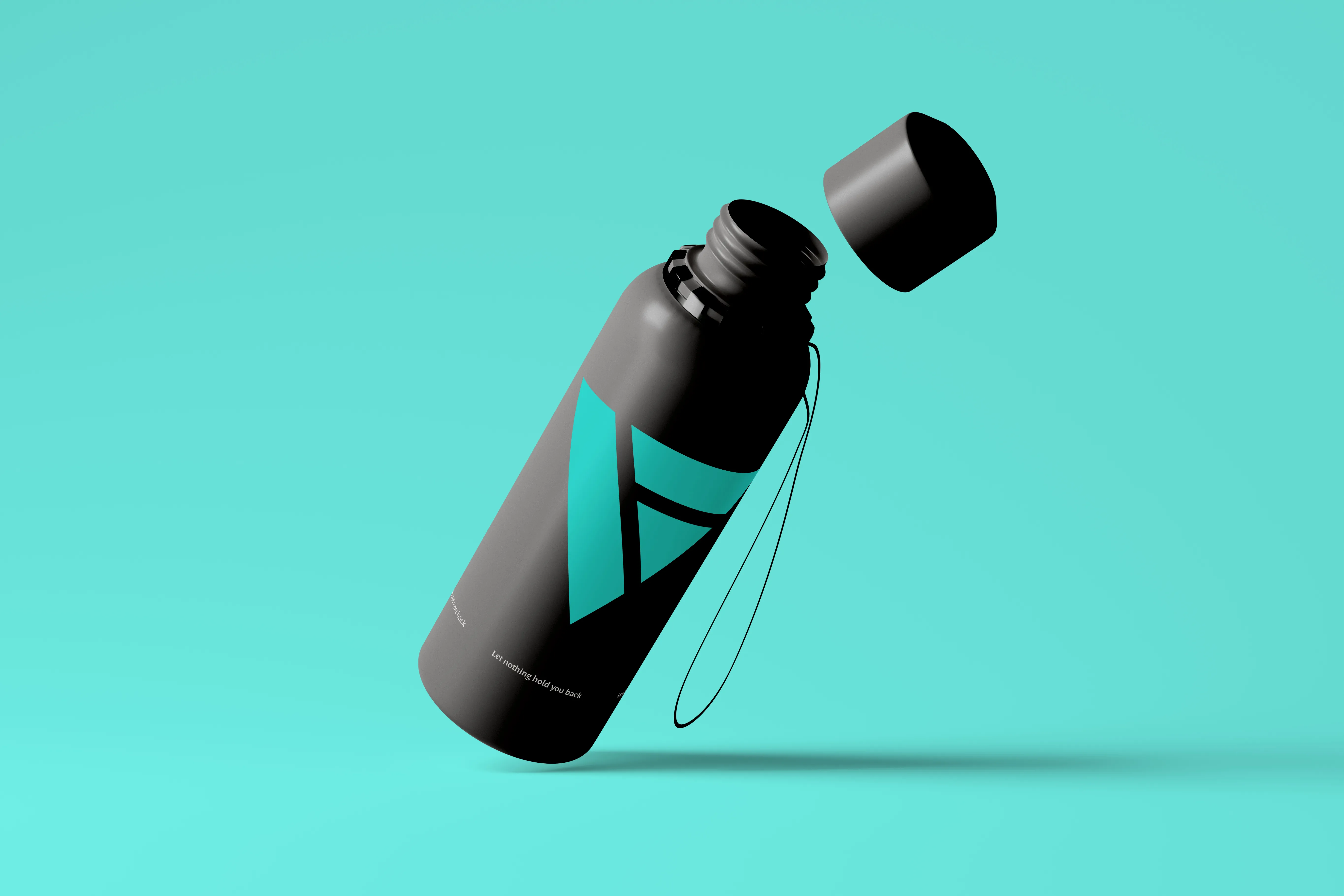
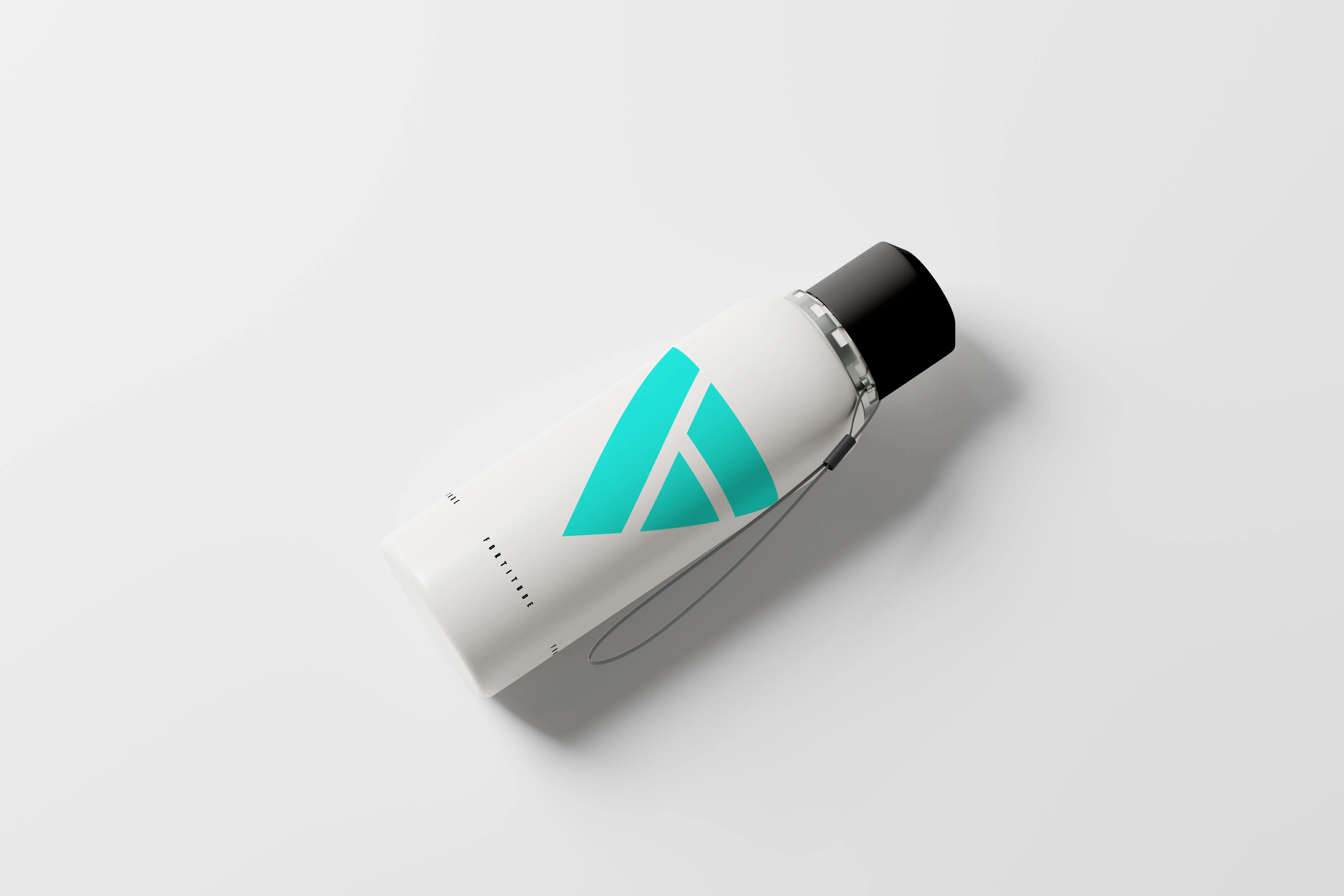
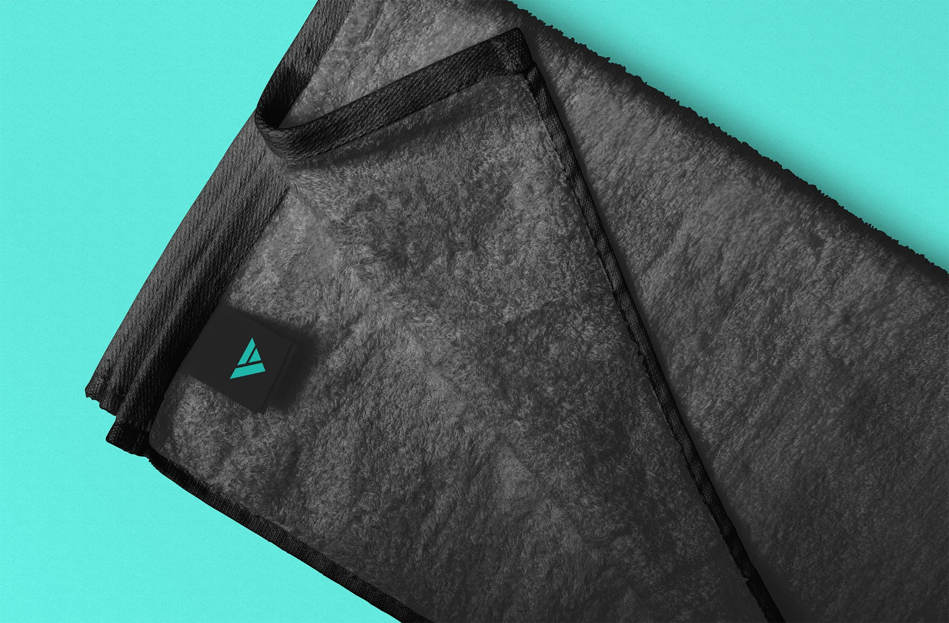
That concept was developed digitally, recreated in Illustrator, paired with the agreed colour palette and typeface, and refined into a cohesive identity. With a few careful adjustments, the foundation of the FORTITUDE brand came to life.