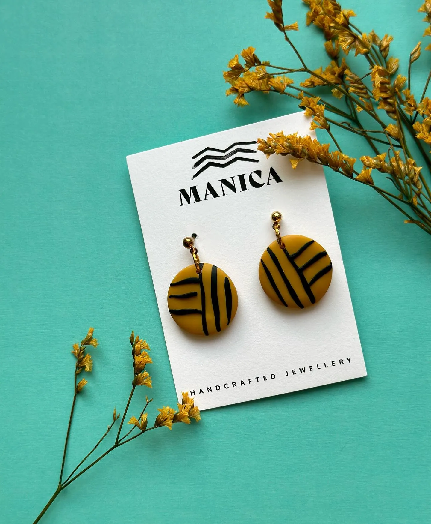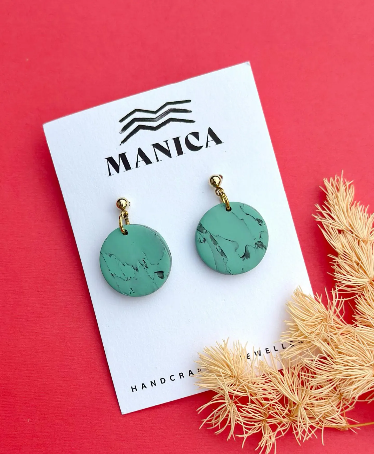
Manica was born from three sisters’ shared love of travel, culture and handcrafted jewellery. From wandering markets around the world to collecting pieces that told stories of people and places, their passion grew into a dream of creating designs of their own. Today that dream lives on in Manica, jewellery that celebrates femininity, identity and authenticity, inspired by their Zimbabwean heritage and brought to life in England.
The journey of Manica began with conversations, Zoom calls and shared stories. From the start, it was clear this brand was about more than jewellery. It was about culture, identity and expression.The sisters shared images of their handcrafted pieces, each carrying the qualities they wanted their brand to hold: natural, crafted, earthy and elegant.
To capture that vision, we explored the rich tones of Zimbabwe and the vibrant contrasts that reflect their strength. These palettes became the foundation of the Manica identity, grounded yet bold, timeless yet modern.Together we shaped the message behind the brand. We Are Enough became more than a tagline.
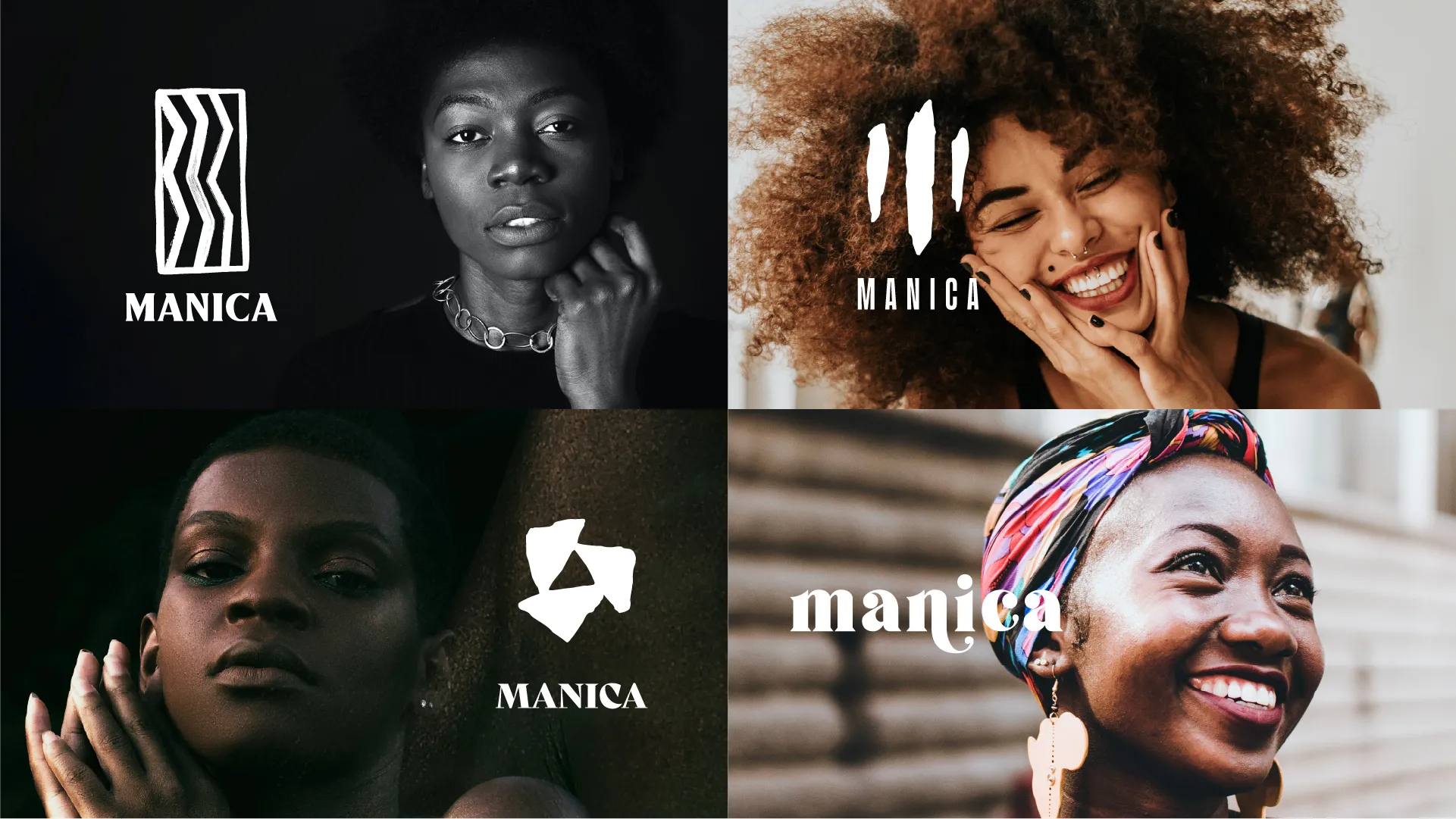
It became a declaration. Manica is for all women, a space to embrace femininity, identity and authenticity through jewellery that carries heritage and meaning.The stylescapes shown here mark the first steps in giving Manica its voice, weaving story, spirit and style into a brand that reflects who they are.



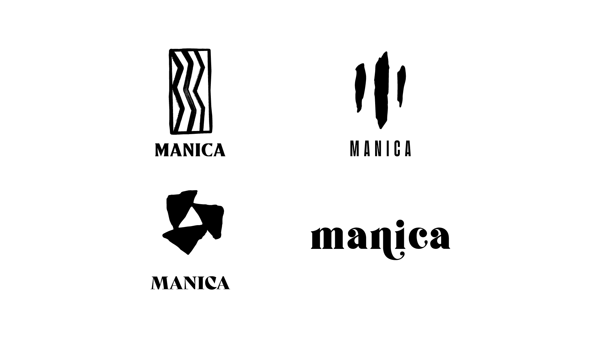
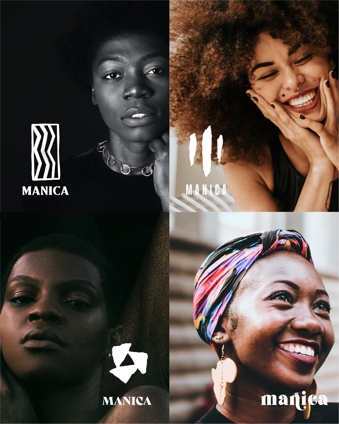
At this stage we started shaping the visual language of Manica. We explored marks and type styles that felt crafted, bold and connected to heritage, while also carrying a sense of elegance and modern appeal. The idea of three was central to many of the early concepts, a reflection of the three sisters at the heart of the brand. We also looked for a balance between a rough, earthy quality in the symbols and a refined elegance in the typeface.




images by @jewellerybymanica