REVERIST POST PRODUCTION is part of the Reverist Group, but it didn’t start out that way. The first name was Reverence Post Production, a way of keeping it tied to the parent brand while giving it its own flavour. We tested the name, and the feedback was clear. People preferred Reverist Post Production. So the name changed, and with it the design shifted too.
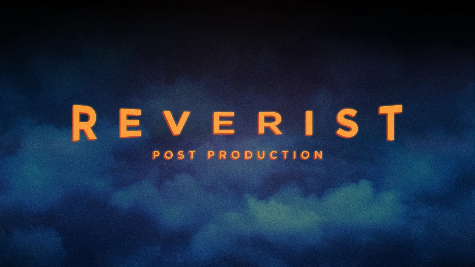
Early on, we tried building the mark from the original Reverist logo. It gave us consistency, but it felt too rigid. What stuck were the clean lines from one idea and the type from another. From there, we steered the look towards something with more character, drawing on old Hollywood for a sense of craft and heritage.

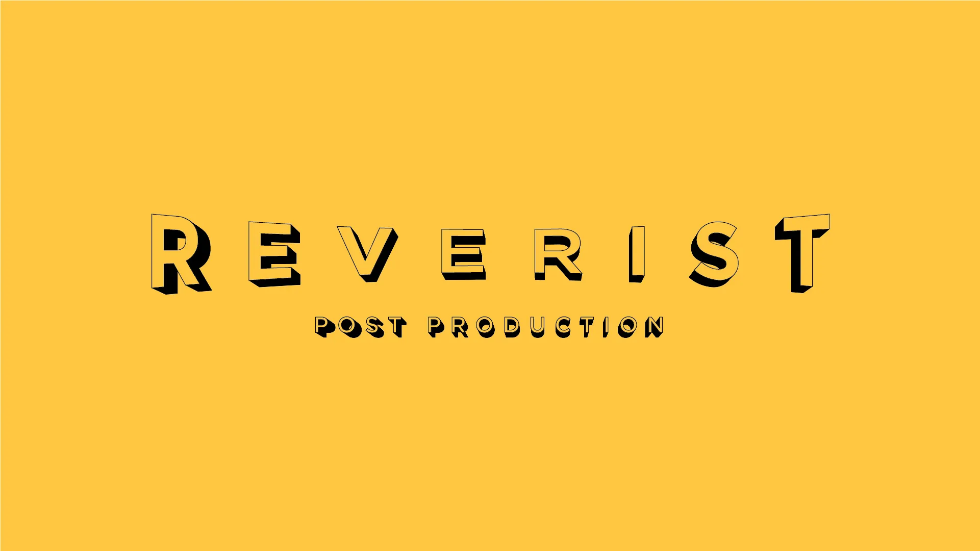
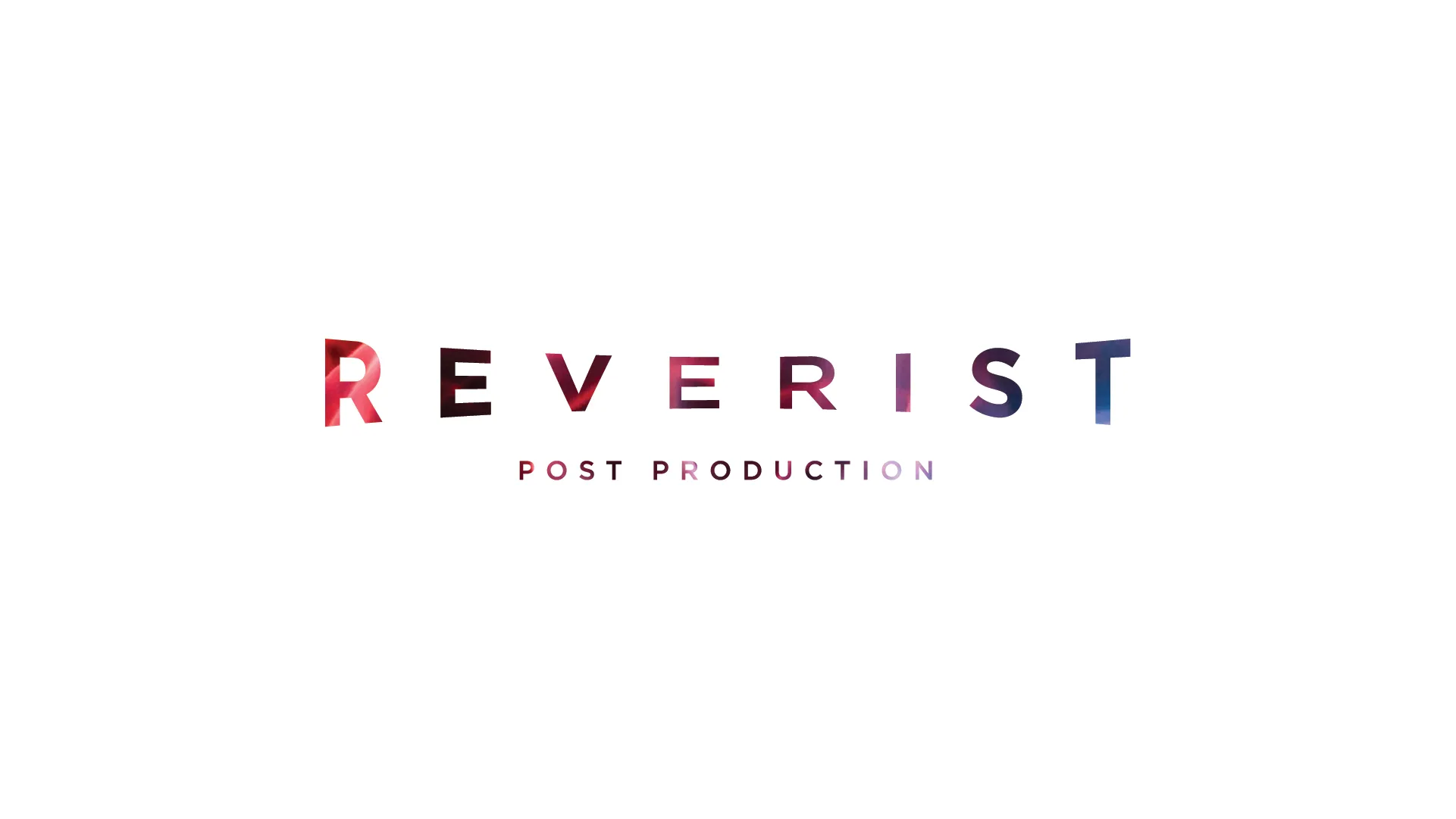
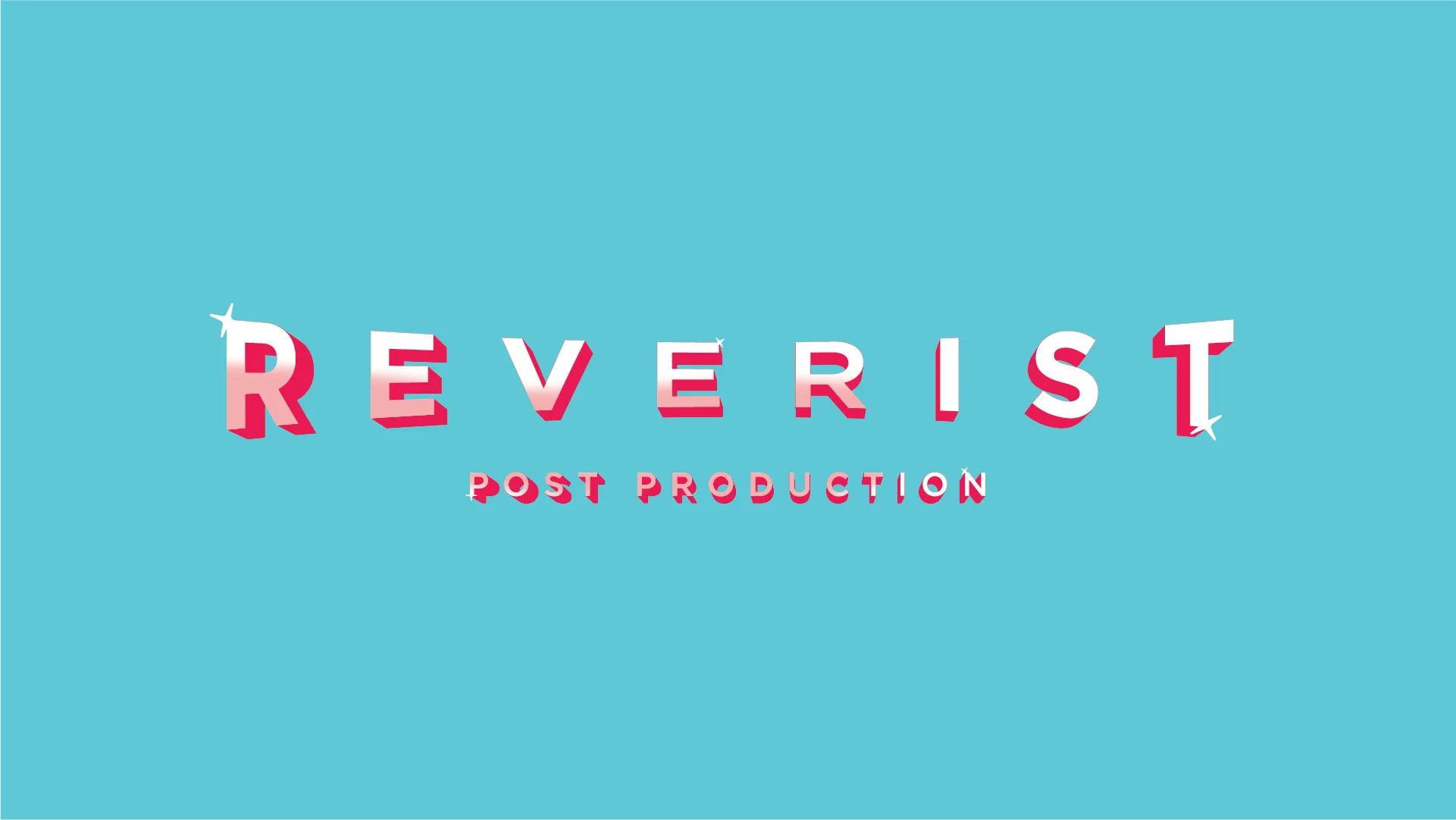
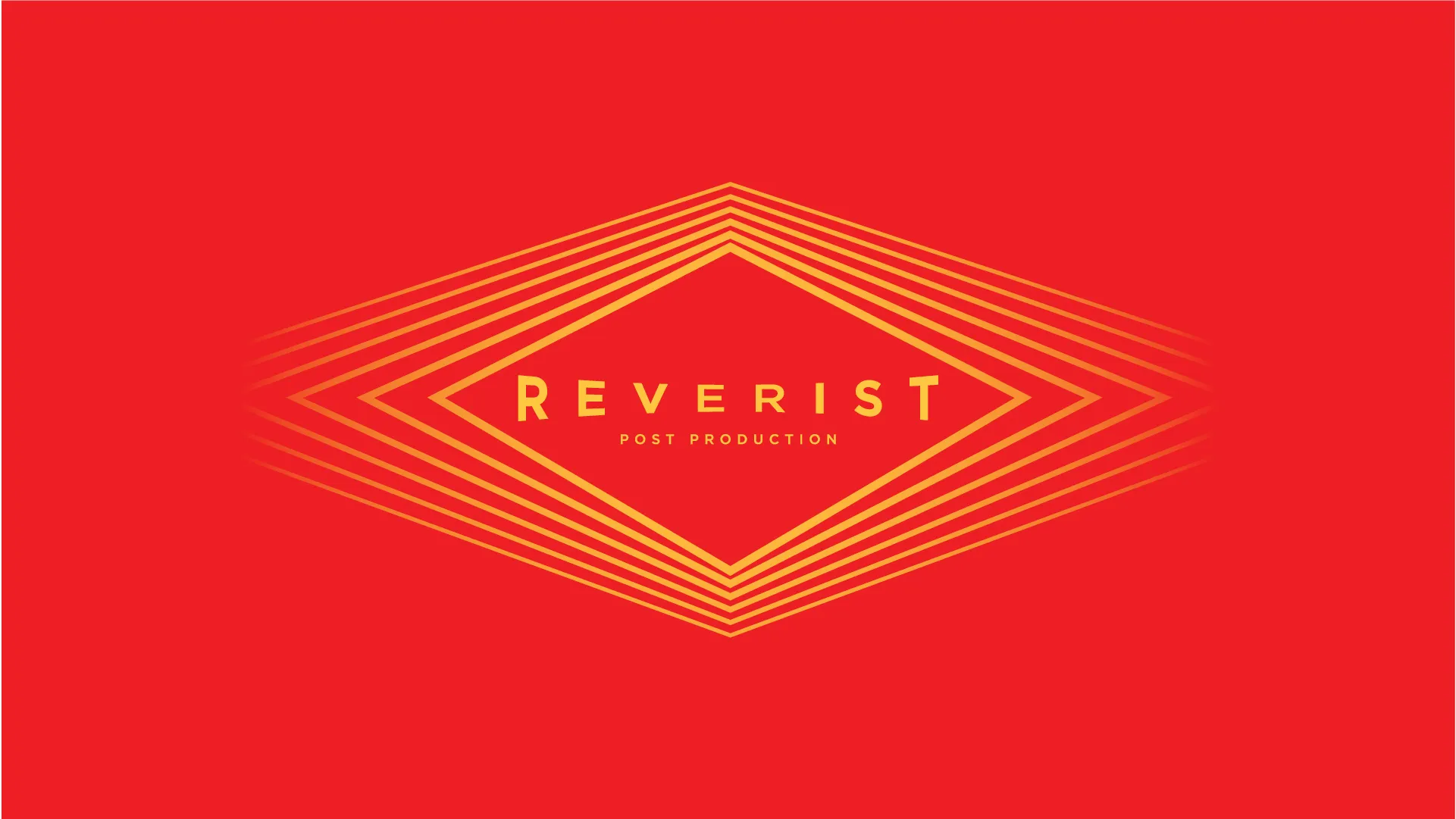
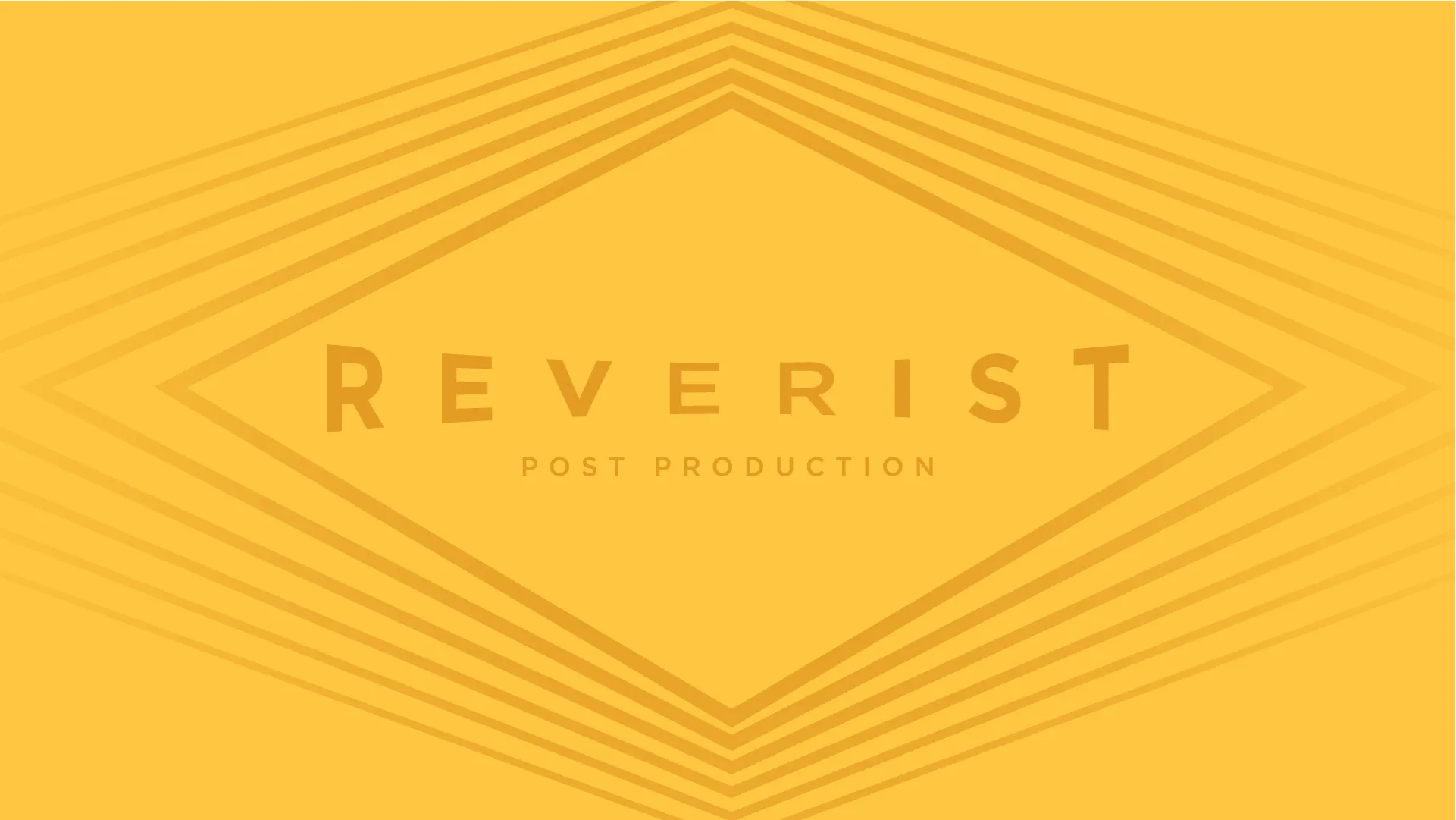
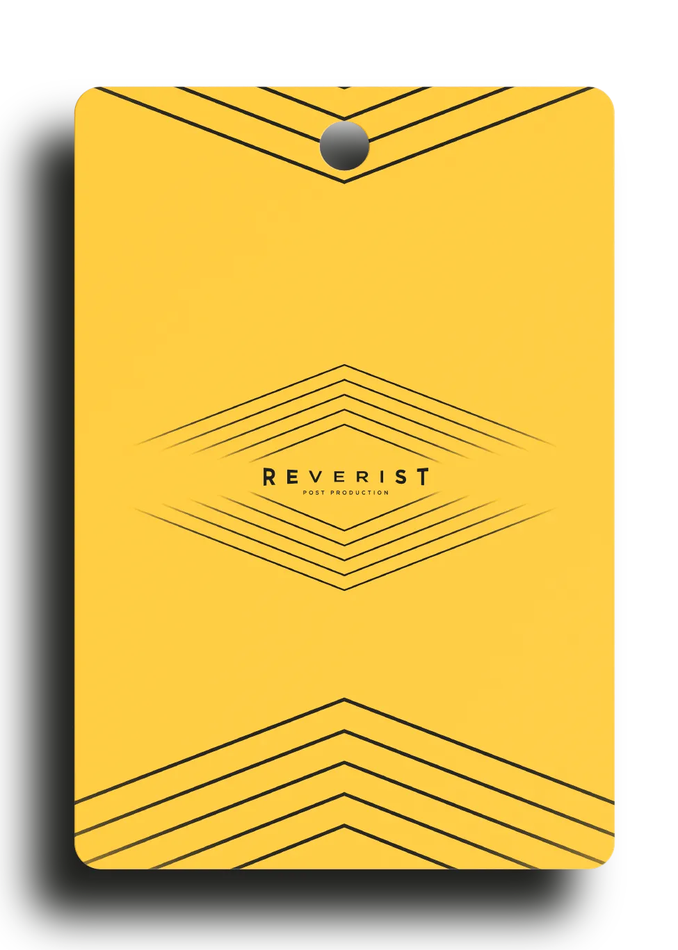
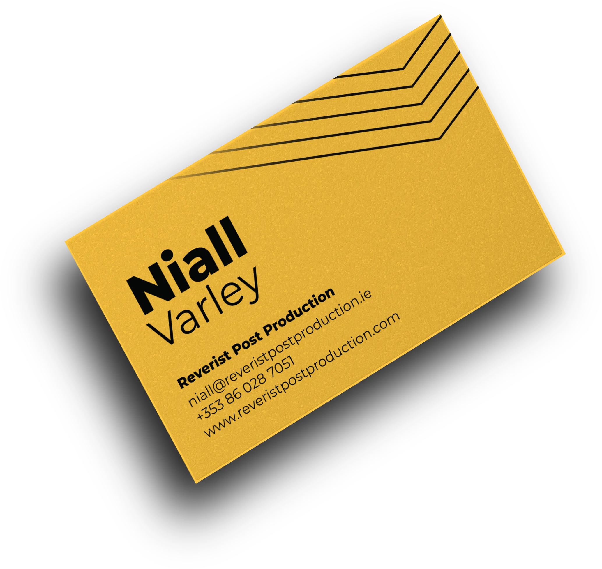
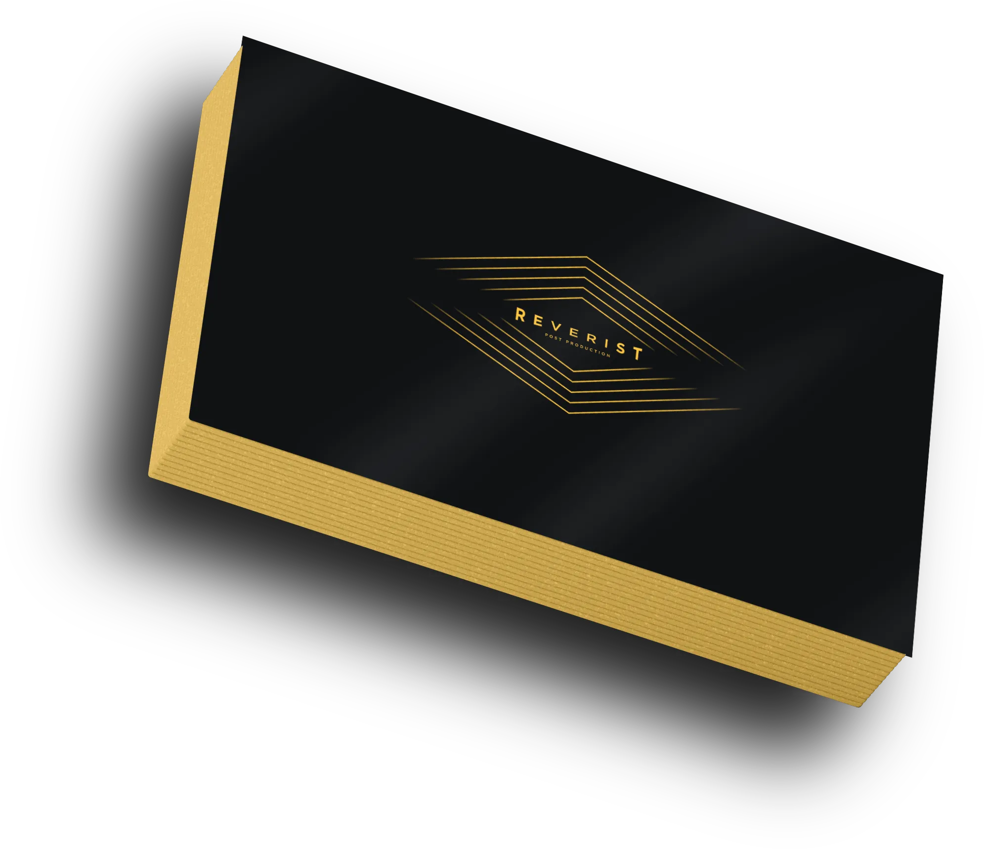
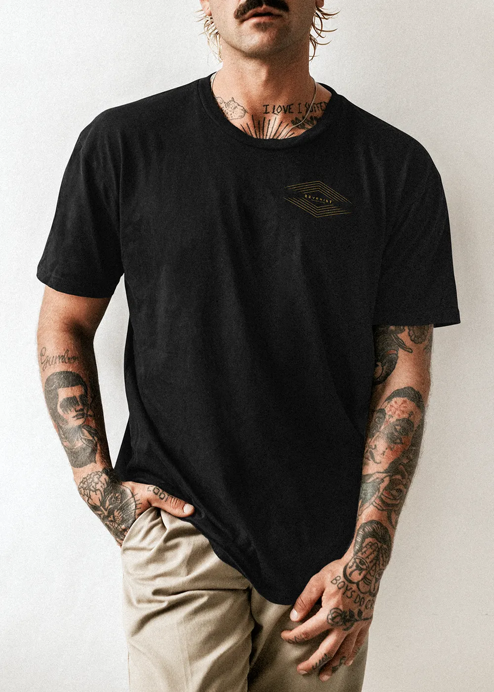
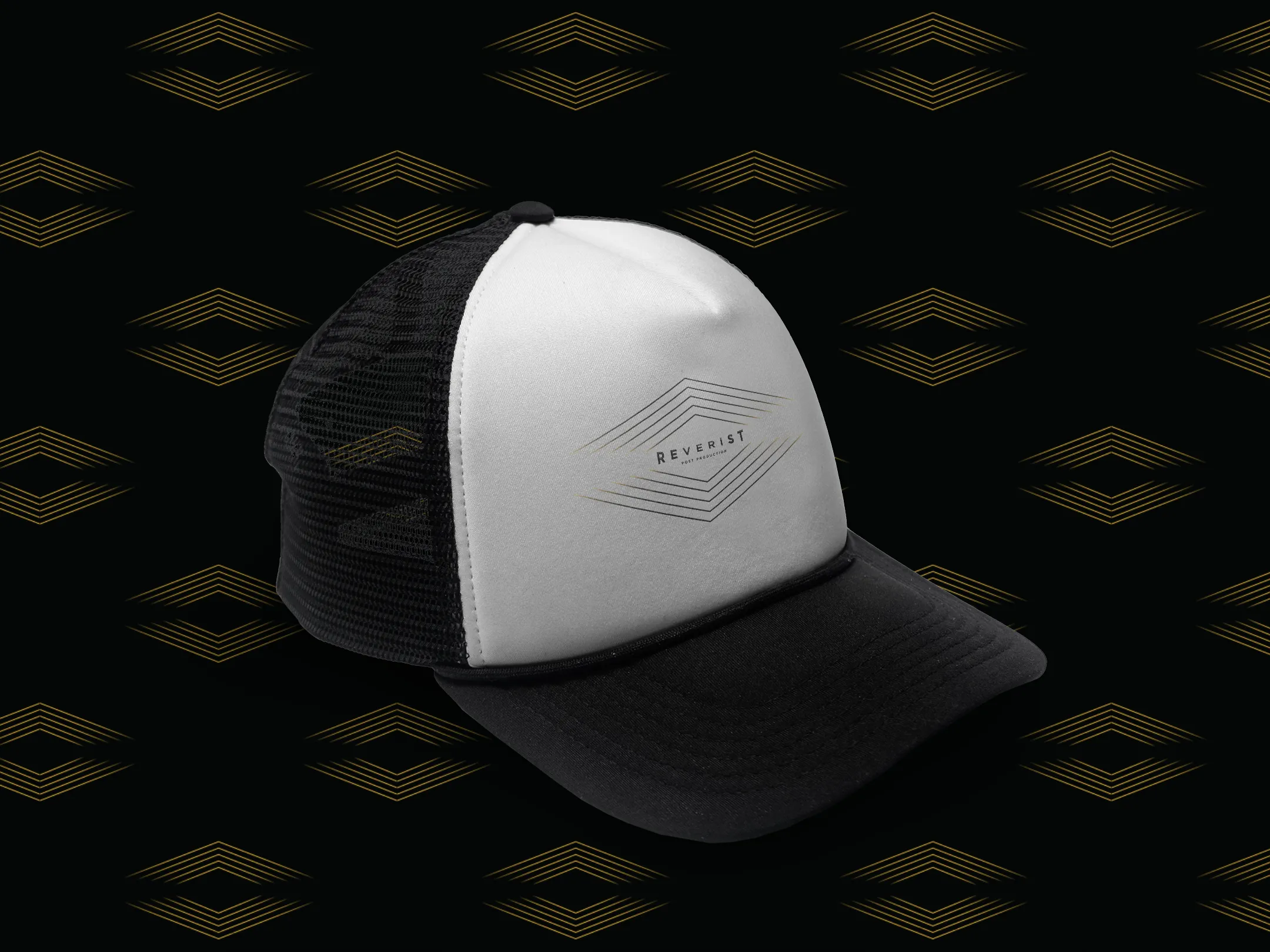
A24 was a big influence on where we wanted to go. The aim was simple: create a mark that worked at its core, instantly recognisable, but adaptable enough to fit any corner of the industry. Retro, horror, cartoon — it had to stretch without snapping. The work in this stage pushed those ideas hard.
We tested how the mark would hold up across different treatments, shifting tone and style while keeping its DNA intact. That process shaped the final core concept: a design strong enough to stand alone, but flexible enough to take on any role.