
Part of being human is understanding context. Different environments demand different things from us. Different rooms have different expectations. Most people adapt instinctively, carrying the same underlying personality from one situation to the next while changing how that personality is expressed.
For decades, consistency has been treated as one of branding's highest ideals. Businesses have invested enormous amounts of time creating systems designed to maintain it. Brand guidelines, templates, tone-of-voice documents and approval processes all exist for good reason. Recognition matters. Familiarity matters. Trust matters.
Yet somewhere along the way, consistency became confused with repetition.
Yet somewhere along the way, consistency became confused with repetition. Yet somewhere along the way, consistency became confused with repetition.
The distinction matters because repetition is simply doing the same thing regardless of circumstance. Consistency is remaining recognisable when circumstances change.
Most successful businesses spend their entire existence adapting. New products appear. New markets emerge. Customer expectations shift. Technology changes. Entire industries evolve. Fidget spinners to Labubu anyone? Monumental! The idea that a brand should remain completely unchanged throughout all of that feels about as realistic as expecting a person to wear the same clothes, tell the same stories and behave the same way for the rest of their life.
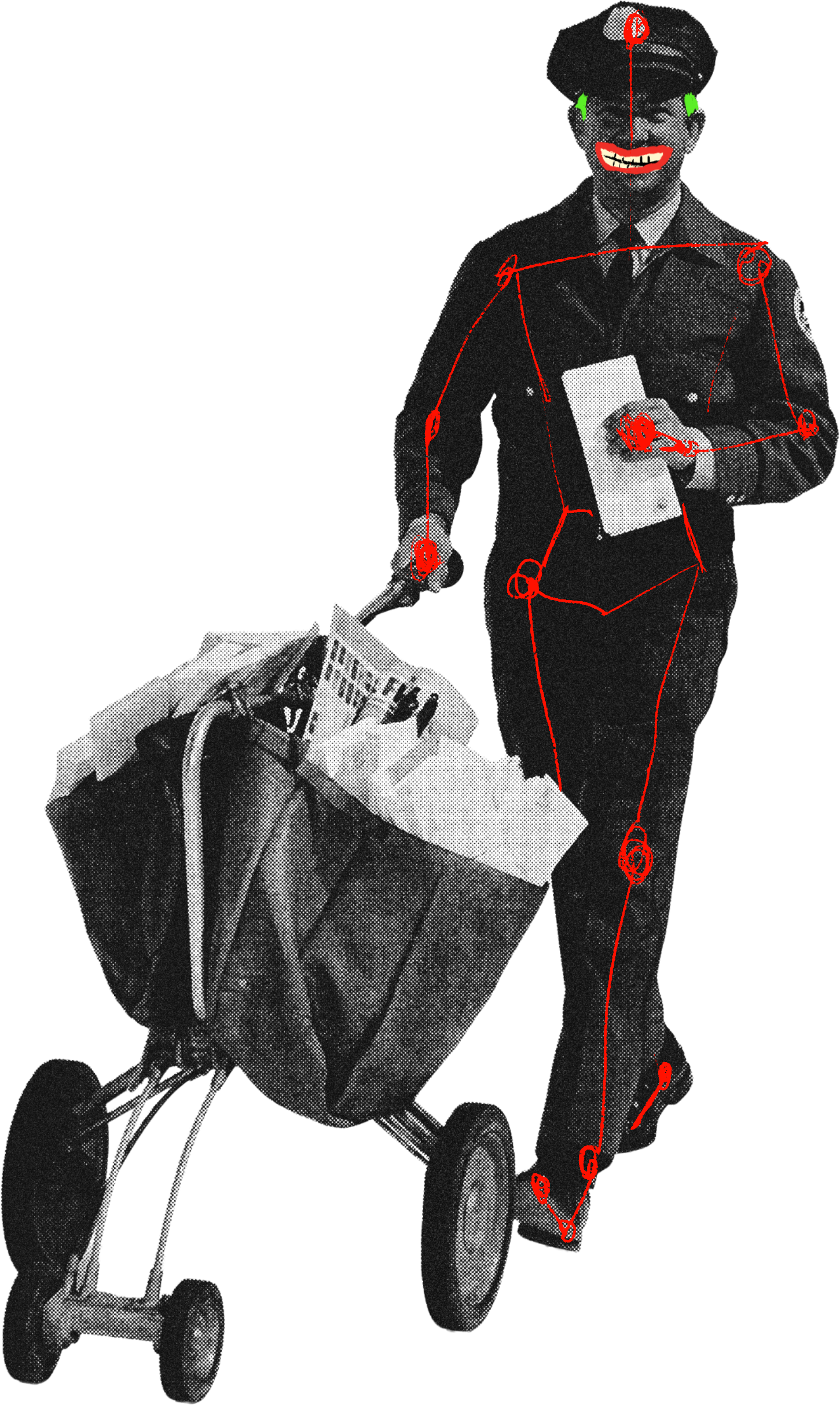
IKEA (adult lego) is a particularly interesting example because the company has already lived through several major changes in how people discover, buy and interact with products. For decades the IKEA catalogue sat in millions of homes and became one of the most widely distributed publications in the world. Then gradually the catalogue disappeared. Websites took over. Apps arrived. Digital experiences became central to the business.
The business changed but it still remained IKEA. Big sacks and meaty balls.
The business changed but it still remained IKEA. Big sacks and meaty balls.
The catalogue changed. The technology changed. The customer journey changed. Yet the company's view of design remained remarkably stable. Good design was still presented as something practical rather than exclusive, useful rather than precious and available to ordinary people rather than a privileged few. The expression evolved. The underlying belief stayed intact.
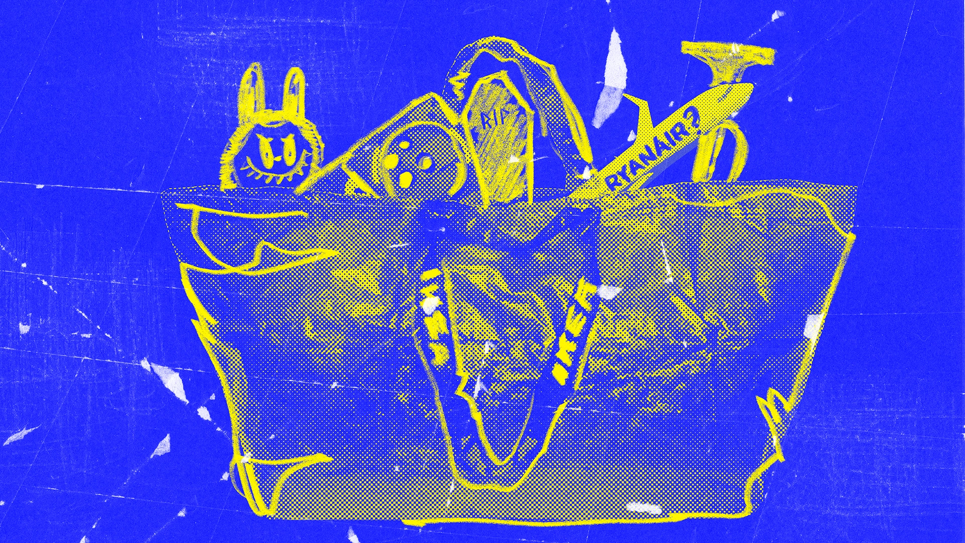
Ryanair provides a different example. Few companies have spent as much time in the public consciousness over the past two decades. Routes have changed. Aircraft interiors have changed. Advertising has changed. The way people interact with the brand has changed. Yet most people already know exactly what kind of experience they're signing up for. Somewhere between measuring a cabin bag with forensic precision and hearing the little victory trumpet fanfare after landing, the brand has become remarkably recognisable. Whether people love it or hate it, the company has built an identity that survives across very different environments.

Nothing, the technology company, has achieved something similar in a much shorter space of time. Technology companies spent years converging towards the same visual territory: polished launches, controlled messaging and increasingly anonymous design language. Nothing recognised an opportunity in behaving differently. Its products feel expressive and its launches borrow heavily from fashion, entertainment and internet culture, but perhaps the more interesting difference is how openly the company participates in the conversation around its own products. Carl Pei (love this guy) regularly discusses criticism, acknowledges what has and hasn't worked and explains the trade-offs behind decisions. Despite all of that openness and experimentation, Nothing never feels directionless because there is a clear identity sitting underneath the surface.
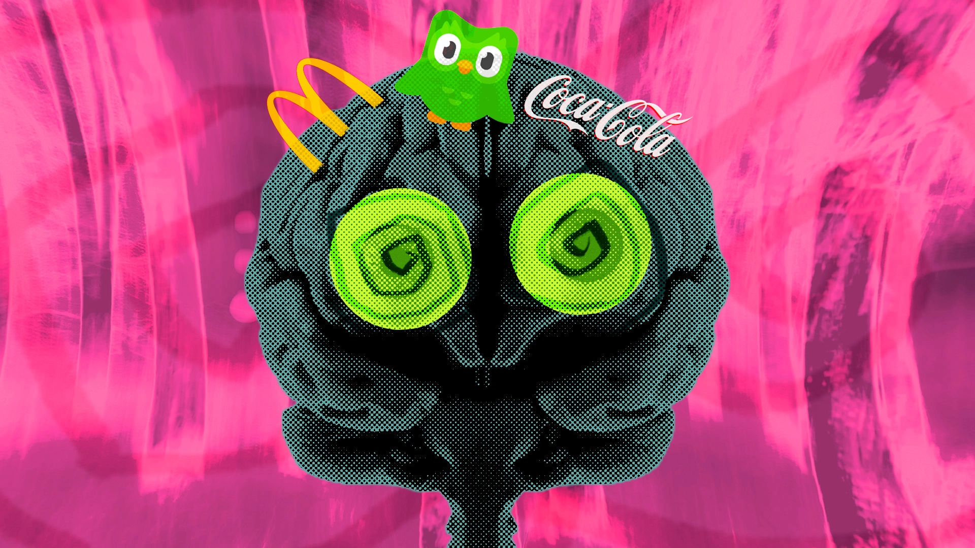
The blue-and-yellow livery of a Ryanair aircraft, IKEA's carefully constructed vision of everyday life and Nothing's transparent design heritage all communicate something long before a logo enters the conversation. Ryanair repeatedly leans into stories about low fares and its own reputation for strict baggage rules. IKEA has spent decades telling stories about ordinary homes, everyday problems and making good design accessible to more people. Nothing talks about technology as though it belongs in culture rather than hidden away in specification sheets. Add the photography, the language, the products and the environments these companies choose to inhabit, and a recognisable identity gradually begins to emerge.
Without an underlying structure, every adaptation risks creating confusion. New campaigns feel disconnected from old ones. New products pull in different directions. Growth starts eroding recognition rather than strengthening it.
The catalogue that once defined IKEA disappeared. Nothing challenged many of the conventions that shaped technology branding. Ryanair developed a public personality that often overshadows its visual identity. Yet all three remain recognisable.
If people aren't remembering the logo, the typography or the carefully constructed grid system, what exactly are they remembering?
If people aren't remembering the logo, the typography or the carefully constructed grid system, what exactly are they remembering?
Perhaps that's why repetition eventually stops working. People don't sit around discussing consistency. They talk about the Ryanair baggage rules. They talk about the IKEA wardrobe that nearly ended a relationship during assembly. They talk about the Nothing phone their friend won't stop putting face-down on the pub table.
Recognition, it turns out, is doing a lot more heavy lifting than repetition ever was.
Because the brands people remember aren't usually the ones that stay the same.
They're the ones you still recognise after they've changed.
If you're not changing, you're dying.
.png)